What Your Mailbox Secretly Says About You
It may only be a few digits, but your home address font can be revealing.
 Credit:
Recommendations are independently chosen by Reviewed's editors. Purchases made through the links below may earn us and our publishing partners a commission.
When you choose a typeface—be it the text for your Tumblr blog or the script for your wedding invitations—you offer a glimpse into your psyche, and your sense of style. Whether you intend to or not, when you choose a font, you're making a statement.
So, if first impressions are everything, doesn’t the typeface for your home's street address say something about you? We’d argue that the numbers on your façade act as a kind of logo that brands both you and your home.
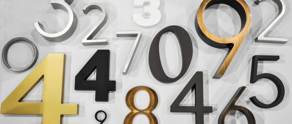
While at this year's Dwell on Design, we checked out the handsome, (mostly) contemporary wares on offer from Architectural Numbers—an L.A.-based maker of metal house address numbers.
With 51 different fonts to choose from, in sizes ranging from 4 inches in height to 24, there’s a match that’s right for almost any home, and any homeowner. The numbers come in a variety of finishes—gold, bronze or black anodized, satin, bronze oxidized, green patina, and 45 colors of enamel—priced around $40 to $45 per digit.
“Clean fonts are what most people with modern or mid-century houses are looking for,” says owner James Kazanchyan. “Most people go to Home Depot, but you don’t find much of a selection.” Off-the-shelf stock at chain home stores is quite a bit more conservative than today’s home trends (albeit cheaper and right there on the shelf).
It got us thinking: What do these numbers reveal? We asked three design experts at the Dwell show for their take. Our informal panel included Brandon Mise (graphic designer and author of Adventures in Letterpress), designer and TV host Ty Pennington, and Amanda Dameron (Editor-in-Chief of Dwell).
All three agreed that address numbers make a statement. “Modern house numbers are of perennial interest to our audience,” said Dameron. “They’re the first hallmark for somebody’s home.”
Ribbon
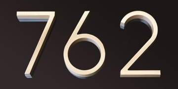
Ribbon / Satin Bronze finish
Ty Pennington: Ribbon is very Guggenheim, very Frank Lloyd Wright. Clean, simple, modern with a touch of art deco feel. These people probably have a very monochromatic look to their home, probably a lot of natural woods, and white walls. It can go on an older or more traditional home, even a Craftsman home, because there’s not too much personality. Brandon Mise: This is someone’s who’s organized and very particular about taste. It’s like art deco—classy and clean, elongated. Amanda Dameron: It tells me that they care about the details on their façade. It’s a clean look, I can tell these people like spare, modern style—this is a design enthusiast.
Futura
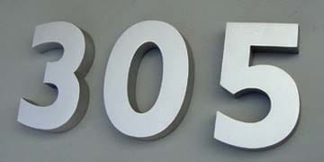
Futura / Clear Anodized finish
BM: This looks like an apartment building, like the person who lives here didn’t make that choice. TP: For all I know, this person is living in a very modern home, or it’s the opposite and in the back there’s an Airstream that fits that gigantic, bold number. You have to be really confident in your home and your mailbox to draw that much attention.
Roffee
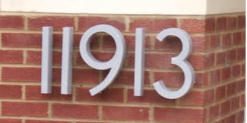
Roffee / Natural Satin Aluminum finish
AD: Roffee is a little more expressive. It’s not for a cold modernist: It’s for someone who wants a little more of a human touch. TP: It’s post-modern. BM: My mind goes to someone who likes the Swedish simplicity of Ikea. Fonts without serifs are more conservative, straight-laced. Someone more modern and young—not a hipster.
Clarendon
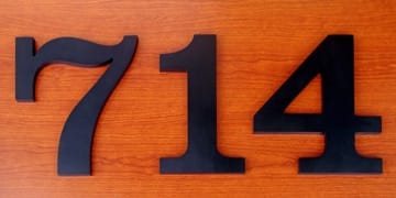
Clarendon Medium / Black Anodized finish
TP: Clarendon is more of a colonial look. This is one I’m definitely just not drawn toward. I can see it being on something more rustic, something Victorian. BM: This person is probably goes to flea markets but finds quality stuff, maybe a more cluttered house. AD: This is a bit of a throwback, someone who’s interested in more of a country look.
Helvetica
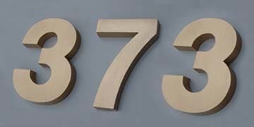
Helvetica / Natural Satin Bronze finish
BM: This is someone more modern with their sense of fashion, more hip. Someone more social. AD: Another design enthusiast. Someone who has a sophisticated take on fonts. Modern. TP: It’s either a modern home or someone who wants to live in a modern home. That big and bold, it would have to be either a very large house or someone with a really bold ego.
Bodoni Condensed
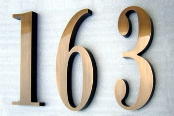
Bodoni Condensed / Bronze Oxidized finish
TP: In this house, you’re probably going to see a lot more brass, Italian marble, more details, maybe columns. It’s definitely a lot more decorative. BM: This is someone older—maybe my parents, who are real estate agents. For some reason that’s their font. It’s more conservative, more money-focused. Might be someone who’s established in their career, but maybe not someone who’s design-oriented.
Copperplate
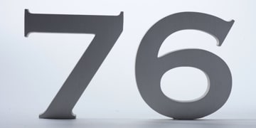
Copperplate / Clear Anodized finish
AD: This is not a modernist. This is somebody who wants a bit of embellishment. TP: I love Copperplate. It’s great, so right now. I see this in old-school delis, old-school barbershops, and on business cards. I think it’s really hip right now because its so period, handmade, artisan. BM: This is someone with a sense for design and fashion, but also an appreciation for old world aesthetics. It’s a traditional font for classic wedding invitations.
Times New Roman
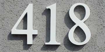
Times New Roman / Baked Enamel "White" finish
BM: I think of a newspaper. These are people who don’t make design choices, they default to set ideas for what it should be. It’s the default font for newspapers. TP: Times New Roman is more traditional and safe. I see tons of neighborhoods having that kind of number of their house. AD: This is a person of letters. An old-school journalist.
Eurostyle Bold Extended
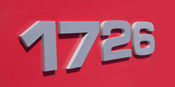
Eurostyle Bold Extended / Satin Aluminum finish
TP: Eurostyle is almost futuristic, or maybe 80s futuristic. It’s really bold, streamlined. AD: The thickness of it is off-putting. It’s not my aesthetic, not the most modern style to me. BM: This is the one I like best—I live here. This is someone into futuristic styles, those that haven’t been invented yet. I would expect to go in and find someone more drawn toward innovation, a creative person on the cutting edge. This is someone whose taste is outside the box, outside the norm or what’s in style.
